Accessibility Statement for Prosperity Path Financials
Prosperity Path Financials is committed to ensuring digital accessibility for everyone. We are continually improving the user experience for all users, and applying the relevant accessibility standards.
Keyboard Navigation

Our website is designed to be fully navigable using a keyboard. Users can access all interactive elements, such as links, buttons, and form fields, using the tab key. We have ensured a logical tab order to facilitate intuitive navigation. Skip navigation links are provided to bypass repetitive content and directly access the main content areas.
- Tab Key: Use the tab key to move forward through interactive elements.
- Shift + Tab: Use shift and tab keys to move backward through interactive elements.
- Enter Key: Activate links and buttons using the enter key.
- Arrow Keys: Use arrow keys to navigate within specific components, such as dropdown menus.
We regularly test keyboard navigation to identify and address any potential issues. Our goal is to provide a seamless and efficient browsing experience for users who rely on keyboard input.
Alternative Text for Images

All images on our website include descriptive alternative text (alt text). This text provides a textual alternative to visual content, making it accessible to users who are blind or have low vision, as well as those using screen readers. The alt text accurately describes the content and function of each image, ensuring that users receive the information conveyed by the image.
Our content creators are trained to write meaningful and concise alt text. Decorative images are given null alt attributes (alt="") to prevent screen readers from announcing them, reducing unnecessary noise and improving the browsing experience.
For complex images, such as charts and graphs, we provide detailed descriptions either within the alt text or in the surrounding text. This ensures that users have access to all the information presented visually.
Color Contrast
We adhere to WCAG (Web Content Accessibility Guidelines) standards for color contrast. Our website's text and background colors are carefully chosen to ensure sufficient contrast, making the content readable for users with low vision or color blindness. We use tools to verify that our color combinations meet the minimum contrast ratios specified by WCAG.
Users can also customize the website's colors using browser extensions or operating system settings. This allows users to adjust the color scheme to their preferences and improve readability.
We avoid using color alone to convey important information. Instead, we use additional cues, such as text labels or icons, to ensure that all users can understand the content, regardless of their color perception.
ARIA Attributes
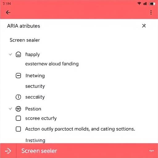
We utilize ARIA (Accessible Rich Internet Applications) attributes to enhance the accessibility of our website. ARIA attributes provide additional semantic information to assistive technologies, such as screen readers, helping them to interpret and present content more accurately. We use ARIA roles, states, and properties to identify and describe interactive elements, dynamic content, and complex widgets.
Examples of ARIA attributes we use include:
- aria-label: Provides a descriptive label for an element, especially when the visual label is insufficient.
- aria-describedby: Associates an element with descriptive text, providing additional context.
- aria-live: Indicates that a region of the page may update dynamically, alerting screen reader users to changes.
- aria-expanded: Indicates whether a collapsible element is currently expanded or collapsed.
By implementing ARIA attributes, we improve the accessibility and usability of our website for users with disabilities.
Responsive Design
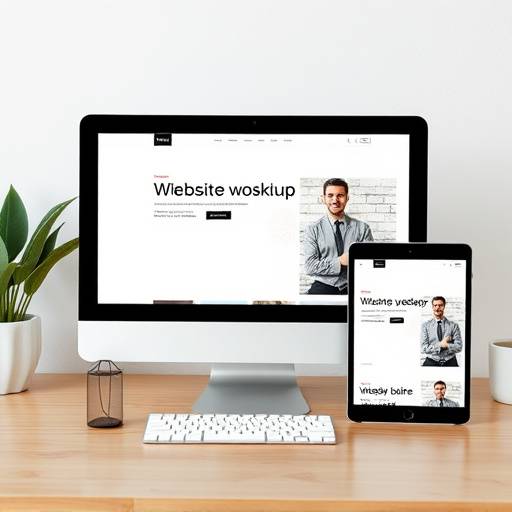
Our website is built with a responsive design, ensuring it adapts seamlessly to different screen sizes and devices. This responsiveness makes the site accessible to users on desktops, laptops, tablets, and smartphones. The layout adjusts automatically to provide an optimal viewing experience, regardless of the device being used.
We test our website on various devices and browsers to ensure compatibility and accessibility. Our responsive design principles include fluid grids, flexible images, and media queries.
By providing a responsive design, we ensure that all users can access our content comfortably and effectively, regardless of their device.
Ongoing Efforts and Feedback
At Prosperity Path Financials, we view accessibility as an ongoing effort. We regularly evaluate our website against WCAG guidelines and implement improvements based on user feedback and accessibility audits. We are committed to providing a continuously improving and inclusive online experience.
We welcome your feedback on the accessibility of our website. If you encounter any accessibility barriers, please contact us:
- Email: accessibility@prosperitypathfinancials.co.ug
- Phone: +256 898 158117
- Address: Plot 42 Nakasero Road, Kampala, Uganda
We will make every effort to address your concerns and improve the accessibility of our website.
Dark Mode
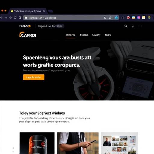
Prosperity Path Financials offers a dark mode option, allowing users to switch to a darker color scheme. This can be beneficial for users with visual sensitivities or those who prefer a lower-contrast display. The dark mode inverts the colors, using light text on a dark background, which can reduce eye strain, especially in low-light environments. A toggle button is available, typically in the header or footer, to easily switch between light and dark modes.
The dark mode feature enhances the overall accessibility and user experience by providing an alternative visual presentation that can cater to individual preferences and needs.